Novelty mugs and New Zealand’s problem with public open space
Wed, September 15, 2021 | Data ScienceThis post from Jesse Prendergast, a Transport Planner and Analyst at MRCagney, was originally published on Linkedin.
If you've been online in the past week (not hard considering there isn't much else to do), you will have heard about Minister Chris Hipkins' unfortunate slip-up behind the now-famous COVID podium. If you haven't, a quick google of the minister's name will tell you all you need to know.
We Kiwi's love a faux-pas, particularly by those higher-up and especially when it's a slightly saucy. This incident is no different. In fact, we seem to love this so much that in a matter of hours, NoFilterCo had a novelty mug to commemorate this memorable occasion.

This mug may seem innocuous enough, but lurking beneath the surface it highlights some issues with the way New Zealand thinks about public space. Greater Auckland did a great job of summarising some of these issues in its recent blog post.
"People need to be able to walk and bike around with plenty of road space for social distancing – without fear of being hit by vehicles. The last thing that those living in higher density areas need is any messaging from the Minister that increases vehicle travel in their neighbourhoods!"
Aside from the fact that we are in a climate emergency, the minister's comments reinforce the idea that "roads are for cars, all other transport choices be damned". All over the world throughout the pandemic, we have seen communities claim back their streets for people - whether they be on foot, bike, or scooter. Pocket parks, bike lanes, and footpath widening all creating room to social distance as well as to enjoy a more relaxed environment.
The memes, song contests, and conversations sparked by Hipkins' remarks reminded me of a piece of R&D work I did last year, and now seems as appropriate a time as any to share that story.
In 2020, amid the first level 4 lockdown, Scott Ebbett and Martin Lambert posted an article entitled "Public open space and active transport connections are more important than ever", in which they argue that we should not be encouraging more people to drive to already crowded public parks, but instead be looking to create attractive active transport options to encourage use of local parks, accessible by cycling and walking.
"The key concern is that higher density communities can be short-changed for outdoor space allocation. Existing parks and public spaces are often treated as if they were a “magic pudding”- endlessly able to meet the needs of an expanding population."
To illustrate this point, Scott posted a map of local parks near his home in Onehunga which showed the 500m walking catchment of those parks overlaying the high-density housing zoning.
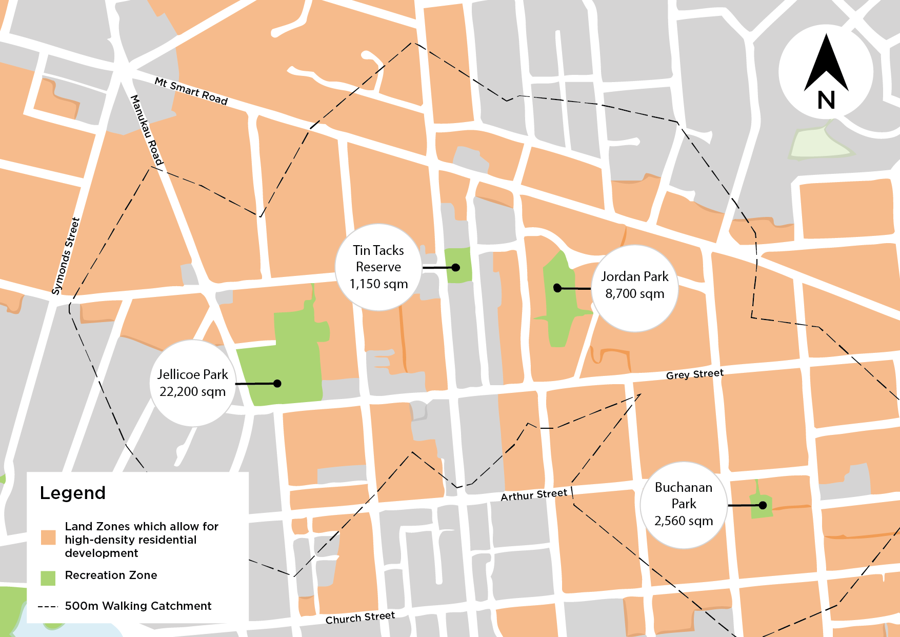
Those who know this area will know that just north of Onehunga lies Cornwall Park, one of the largest parks in the central isthmus of Auckland. While Scott is right to point out the potential for these parks to be seen as "magic pudding" to meet whatever demand is foisted upon them, I thought it a little disingenuous to exclude such a large public open space resource from his discussion. Below is a screenshot from OpenStreetMap which shows the extent of the map from Scott's article, as well as the many parks it didn't include.
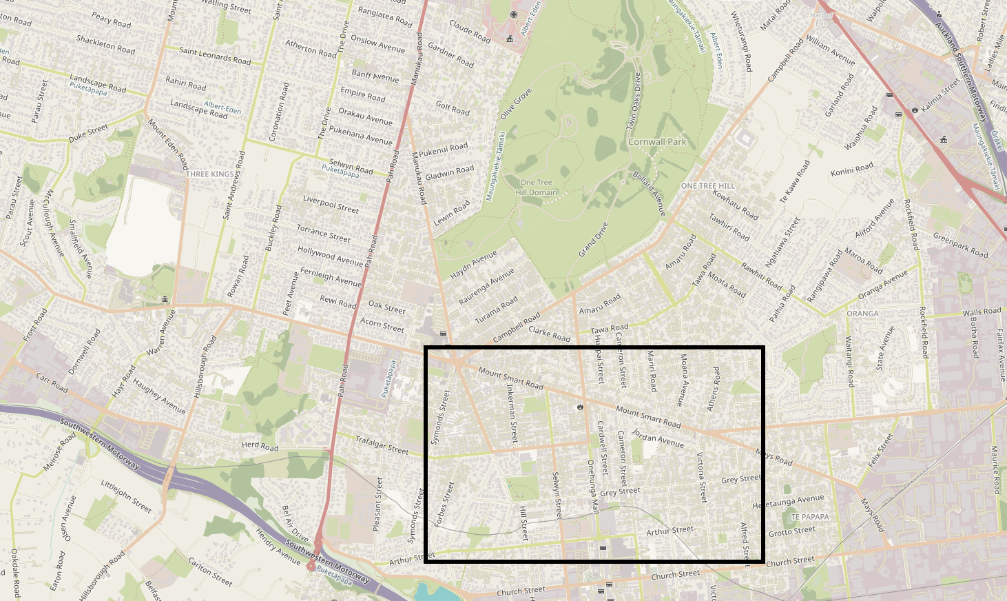
Well, I say "didn't include", when it's fairer to say "couldn't include". What was Scott to do, say "there are parks beyond the extent of this map which we've included but you just have to believe us"? Was he to keep zooming out to include extra parks until the scale became too big to be human? No, I think the article does a good job of highlighting exactly the problems and solutions it needs to.
However, as a data nerd and someone who loves a challenge, I decided that I would do that analysis. And because I'm a sucker for punishment, I would do it using programming. This is that story.
Before I begin I'd like to point to some work done by Abley which asks "is Auckland is a 15-minute city?". Their work has some fantastic maps, a great description of the concept of '15-minute cities', and looks at more than just open space. This post drills a little deeper into public open space, but I thought you all should check out Abley's work too.
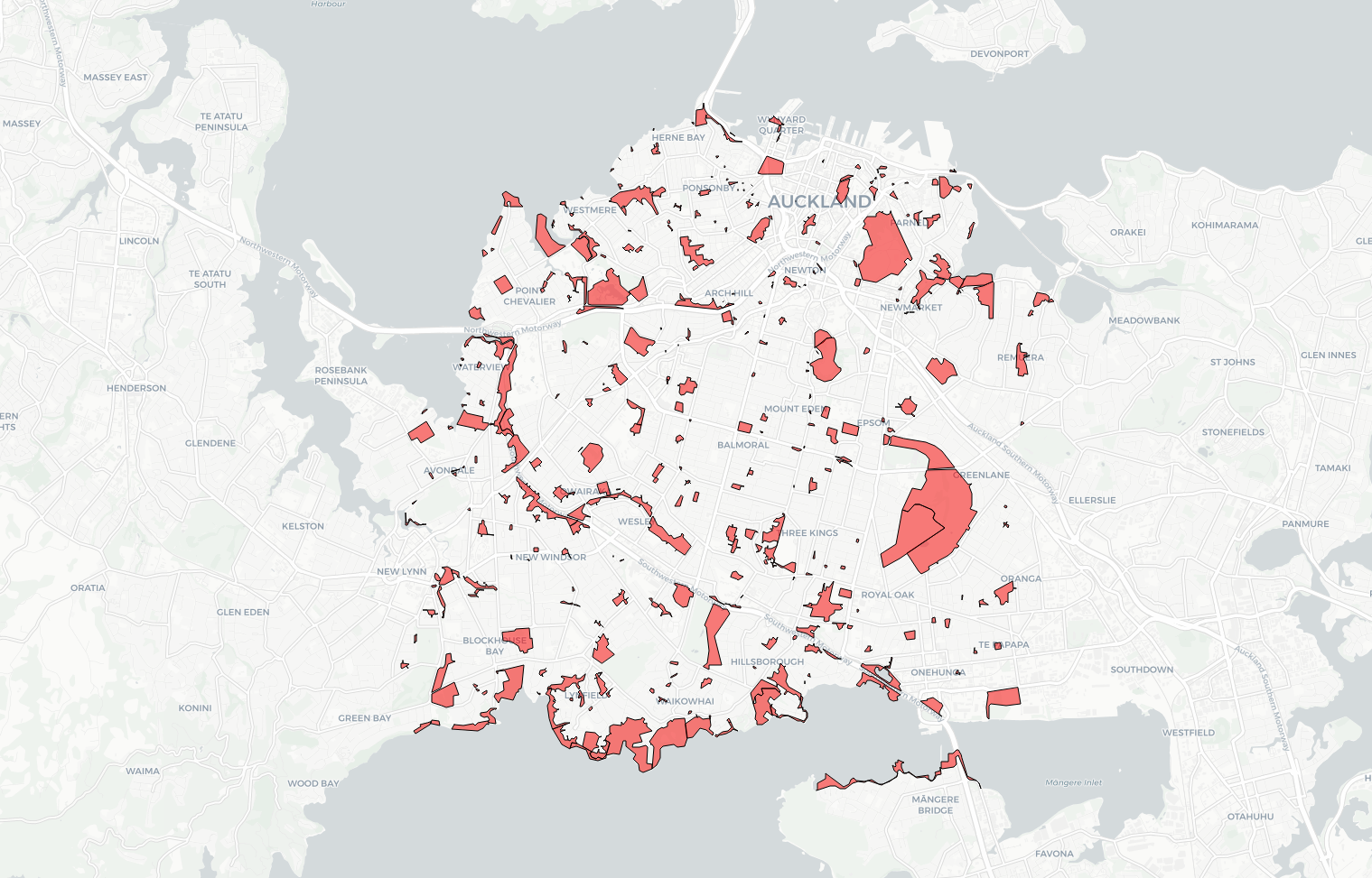
Using data from OpenStreetMap, a wonderful, collaborative, open-source mapping tool I collected all parks (big and small) in the region of Auckland's central isthmus.
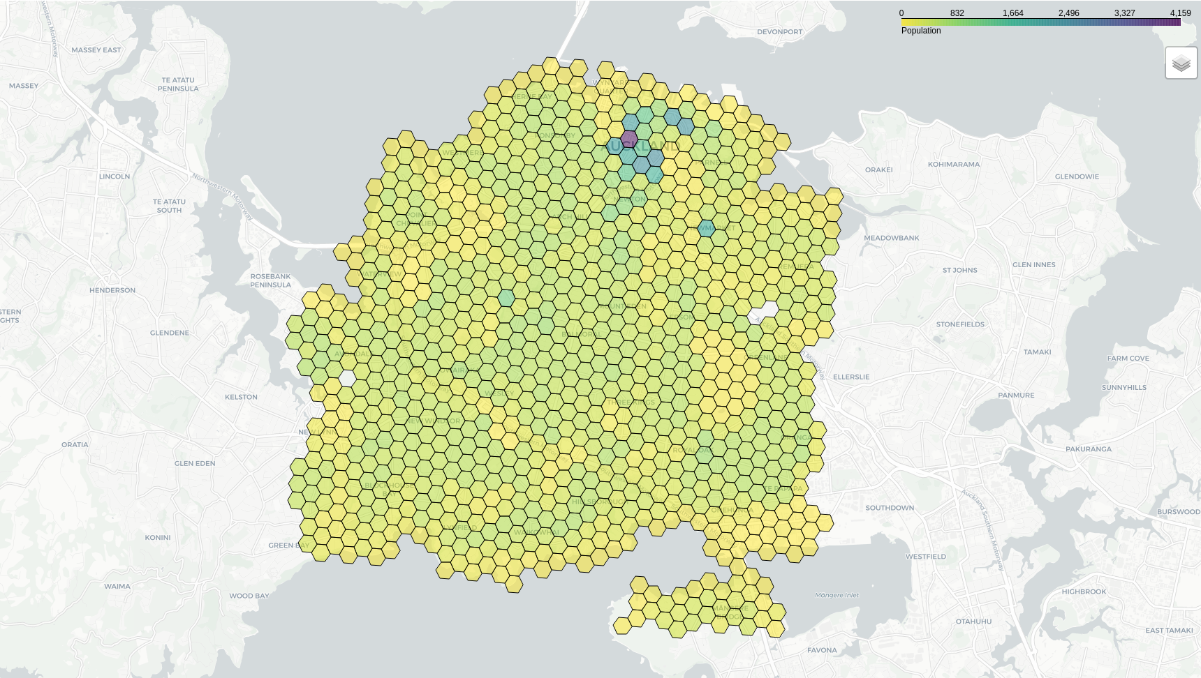
Using the 2018 New Zealand Census, I then mapped the population of the same region, separated into a hexagonal grid (for information on why I did this, see Hexagons are the Bestagons by CGP Grey). Unsurprisingly, there is a large population density close to the city centre, with a patchwork of low-medium density throughout the rest of the isthmus.
For every cell in the hex grid, I used Targomo to create an isochrone that described the area someone could walk within 10 minutes. Here it is good to note that this analysis falls into the trap that a lot of planning does - assuming everyone is able to walk at the same pace, across all streetscapes, in all environments. Of course, this is not the case and everything we can do to make our street network safe, obvious, and step-free will make our cities better for everyone.
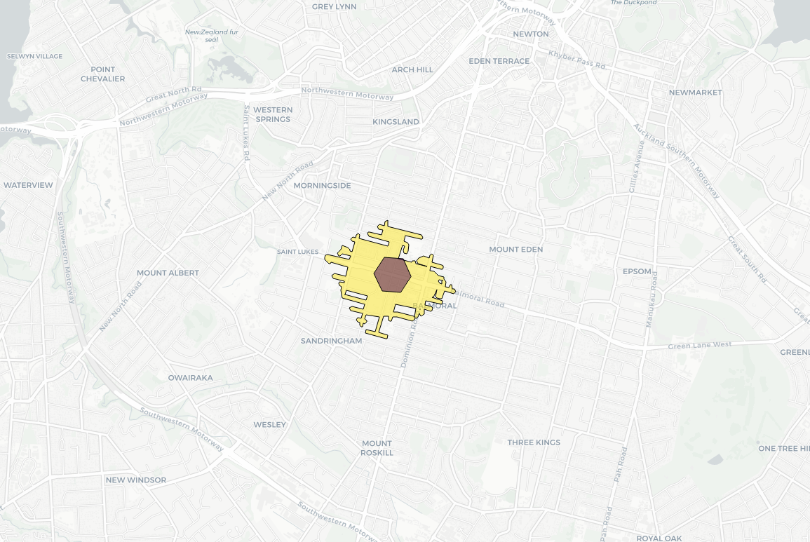
Below is an example cell, on St Lukes Road, and the 10 minute walking isochrone.
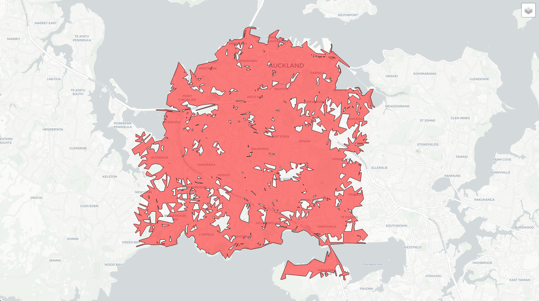
Colouring the cells of the hex grid by the total area of parks within a 10 minute walking catchment paints a picture of public open space accessibility in Auckland.
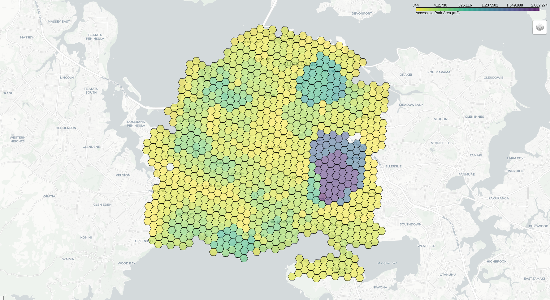
It's fairly easy to see that people who live near large parks (e.g. Cornwall Park, Auckland Domain, Western Springs) have plentiful access. However, this map also highlights public open space 'deserts' where those who live there have little-to-no access to quality open space. For example, look at the central isthmus (where light rail is currently under investigation - which would lead to higher density and larger populations).
The yellow on the map indicates areas where residents can walk 10 minutes and access relatively little public open space. These are the areas Hipkins is talking about, where people feel like they need to drive to get access to "quality" open space. And as Auckland looks to intensify it's housing stock, it's only going to become more crowded.
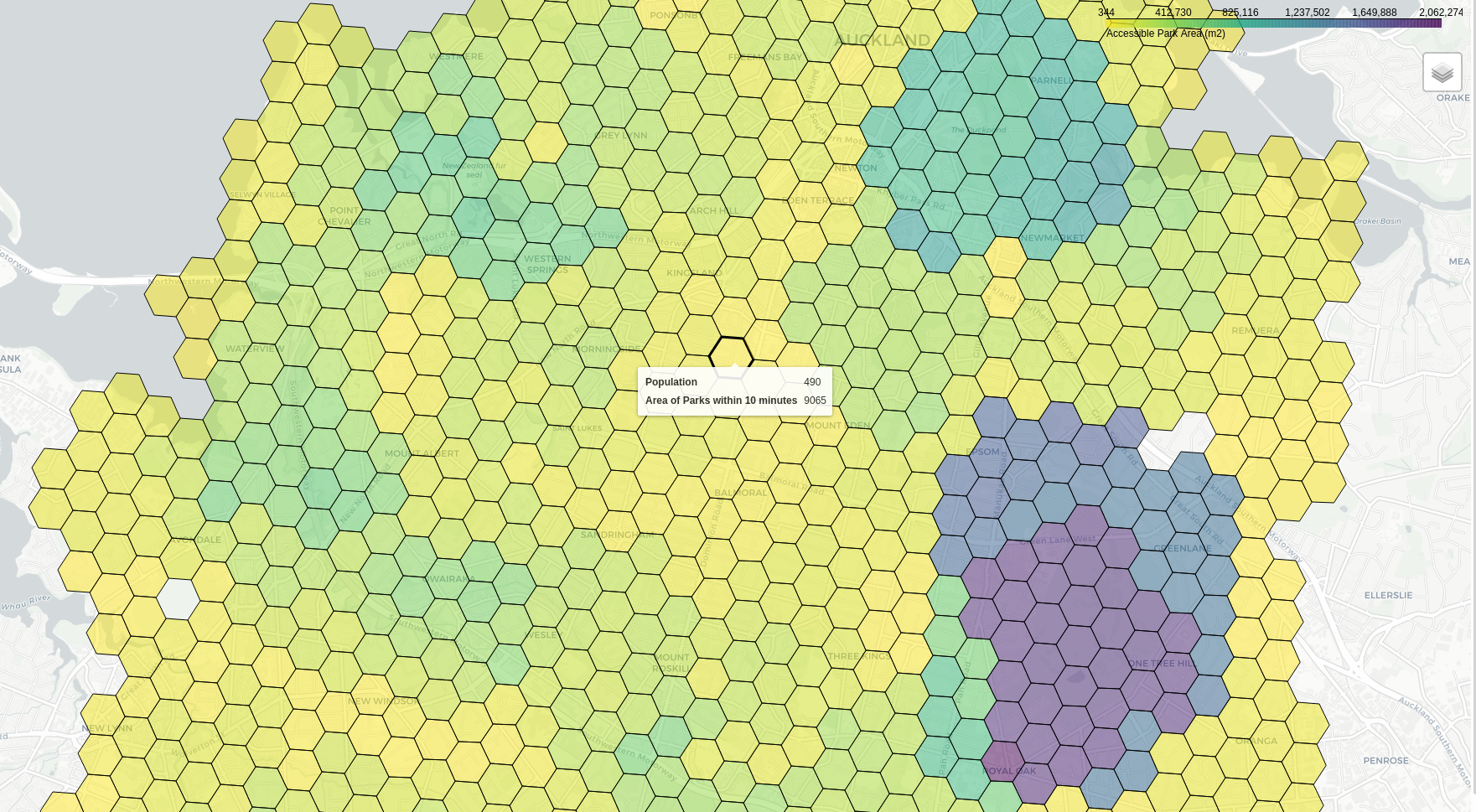
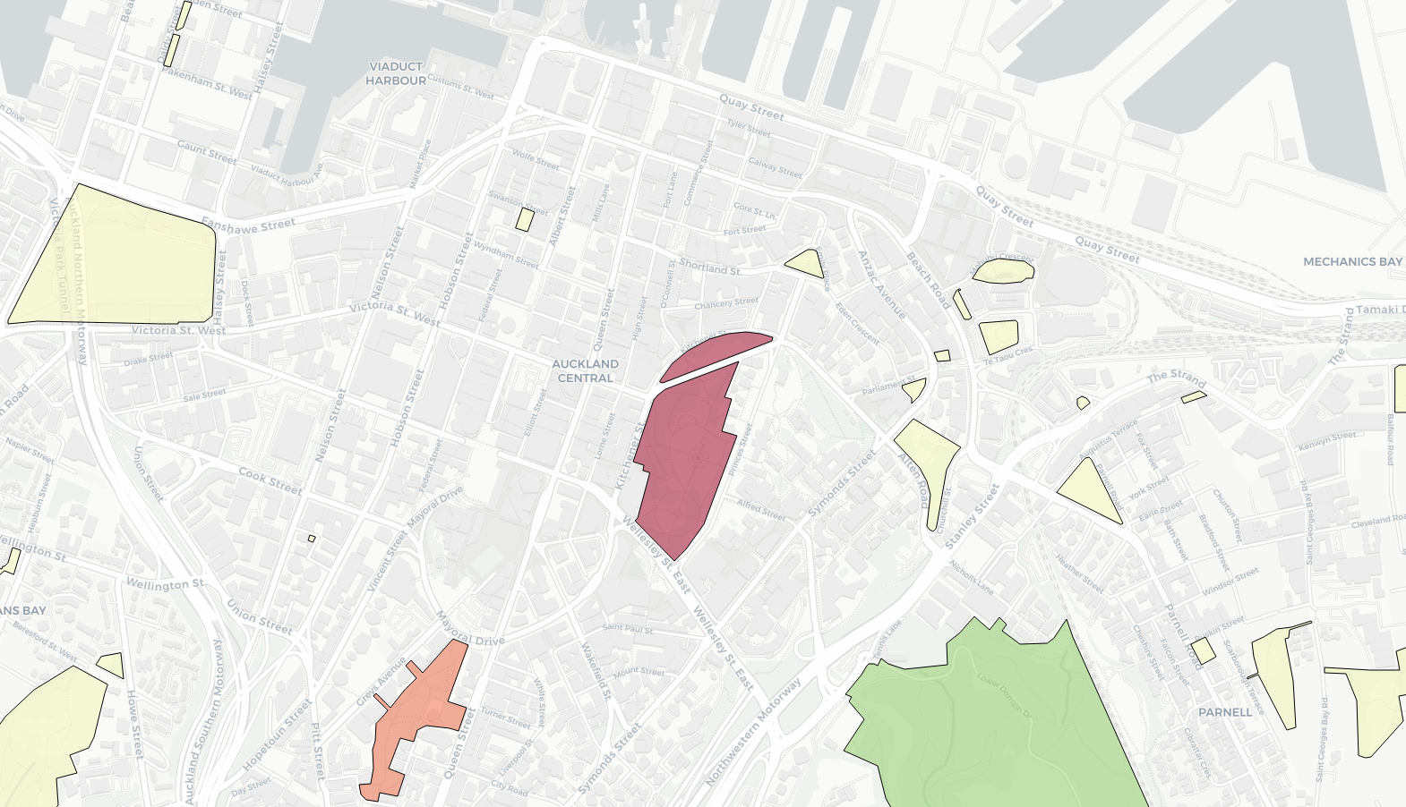
For those who don't have a microscope handy - that is part of a central Auckland suburb (which is likely to intensify in response to the NPS-UD) that only has access to 0.9 hectares of parks within a 10 minute walk! For context, a rugby field is 0.7 hectares (excluding the dead-ball line, any sideline supporter space, and room for Damian McKenzie to clear a 50+ metre kick). That's not to say the nearly 500 residents of this area have that 0.9 hectares to themselves either, they'd be competing with everyone else from the surrounding streets.
It was then that we presented this work to Martin Lambert, of Otium Planning Group, who suggested instead of looking at people's access to parks, we investigate park's access to people. After all, a park with no people is no good for anyone and a park with too many people is no good for everyone. So, I did exactly that: looked at how far one can live and still be within a 10 minute walk of each park (Targomo has a neat feature where you can set the location as either the source or destination for the isochrone).
That's pretty good coverage- but how big are these parks, and how many people do you have to share them with?
In areas where people can access more than one park within 10 minutes, I split the population so more people choose to go to a bigger park. I then coloured each parks by the number of people who could access it within a 10 minute walk.
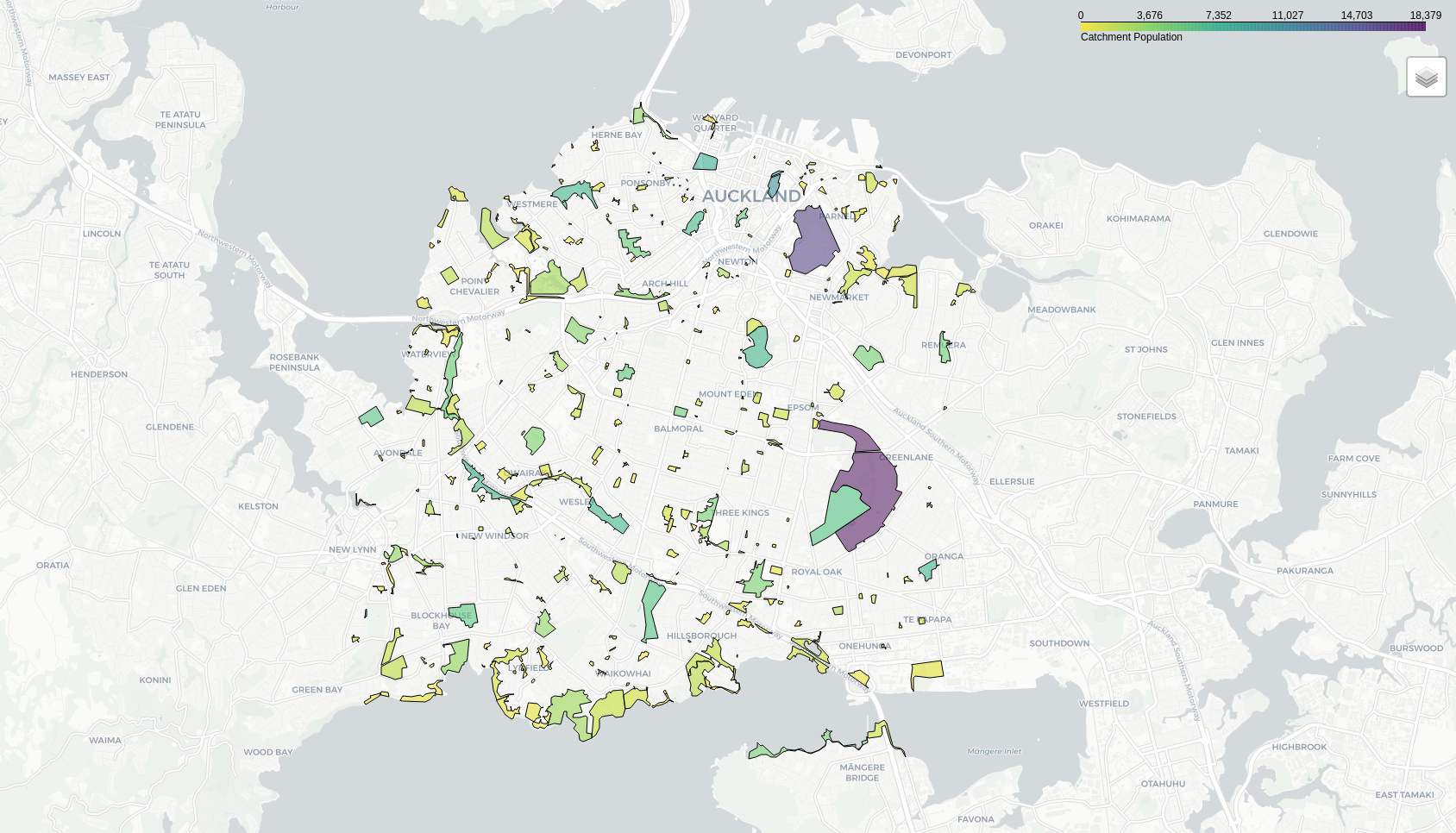
(Cornwall park looks a little weird with that smaller blue section because *technically* that is One Tree Hill Domain).
Taking guidance from Martin, I assumed that each person needs 10 square metres of public open space and calculated how many people each park could theoretically hold, and what the 'latent' capacity in each park was.
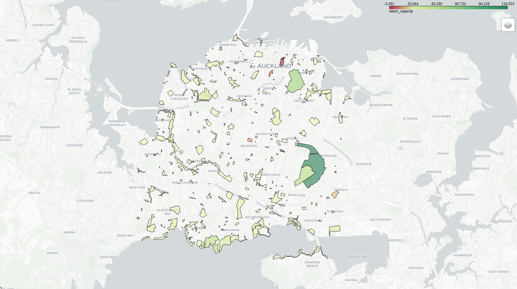
As you may expect, parks in the city centre are oversubscribed, with too many people within walking distance of a small number of parks. And resident populations here are expected to grow in the coming years.
Conversely, in the suburbs there are both areas where people have little access to public space, and parks with plenty of latent capacity. Cornwall Park looks to have a lot of spare capacity - we just need to make it easier for people to walk there!
Does Auckland (and New Zealand) need to change its approach to public open space planning? Do we need to start putting people closer to public open space? Do we need to start putting parks next to people? And in the meantime, how do we create walking and cycling links to our best open space assets that encourage people to use them? My colleague, Malcolm McCracken, has been writing some excellent articles about walkability to rapid transit and creating pedestrian cut-throughs. Improving walkability also improves access to other resources, such as parks, schools, and shops.
This is the point in the article where I need to acknowledge that there are definitely limitations to this work. For example, park areas are not based on usable area, but rather the area on the map - somewhere like Mount Eden actually has far less public open space than it seems. This is a piece of research that is meant to facilitate conversation about how we might better plan our cities to be resilient and open for everyone.
There are many avenues to explore with this, including (but not limited to) cycling and driving catchments, exploring access to sports fields or playgrounds, investigating latent capacity under the unitary plan and future population projections, and much much more.
If you have any thoughts on this analysis, it's implications, or things you'd like to see in future, please get in touch via LinkedIn or email datascience@mrcagney.com.
All maps were created using Leaflet, OpenStreetMap, and CartoDB.